18
Jun
2016
News

Devs Play Ep. 10: “Hunger for Blubber”

by picaresque

Ahoy there!

The new Episode 10 of our Devs Play video series is out!

Watch Episode 10:

Mex, our game designer, will show you how and where to look for sea creatures. A captain has to show to  well know the seven seas! Find information about whale areas and keep track of their migration routes.

Enjoy the video!

The Picaresque Team

7
May
2016
News

Devs Play Ep. 7: “Level Up & Quests”

by picaresque

Ahoy!

The new Episode 7 of the series “Devs play” is out!

Watch the Episode 7:

Mex, our game designer, will show you how and when to level up your characters. Which are those aspects of the game affected by your level? Moreover, you’ll take a look at the quests system in Nantucket so, buckle up and enjoy the video!

Godspeed and may the fair wind be with you all!

The Picaresque Team

16
Apr
2016
DevBlog

UI Combat: Let’s fight!

by Capt_Eatbones

Drink, ye harpooneers! drink and swear, ye men that man the deathful whaleboat’s bow…

This will be the last article about the combat and before we start, I’d like to point out a couple of aspects of Nantucket. As you probably know, one main aspect of the game style is that is made of paper. It’s an experience played onto the Captain’s table, in his cabin and sometime is played in a harbor. Even so, the harbor is an illustration drawn on paper too.
When we thought of a combat style for this game, it came natural to us moving towards something mostly related with a table and a bunch of pieces of paper: a card game.
This combat is not a Trading Card Game. We’ve chosen a card style due to the context of this game: ship, crew, sailing. And, of course, we like playing card games too. Nantucket, per se, is not a card game, but includes a little card game played during the combat. Now, let’s move on with the article main subject.

Today, we are going to have a look at the actual combat phase UI. I want to share with you a first mock-up (this is a frame of an animated one):

CombatAnimMockupCombat 3.0 – Animated Mock-up (Still)

In the picture above you can see a still of the animated mock-up we prepared before starting the implementation. We needed this to define the timings of the overall combat experience. If you have red the previous articles (if you don’t, you can catch up here and here) you already know how the combat has evolved and how the previous Deployment phase works. Once you start the real fight, you have to roll the combat dices of the crew members you have in your whaleboats and decide which command is the best to win against your opponent.

CommandChoiceCombat 3.0 – Dice roll and Command choice

 As you can see, these images are from an early mock-up and the dices faces are not final. The main concept, though, is there: according to the crew members you’ve placed onto the whaleboats you’ll have several dices combinations. Each dice face, when rolled, will unveil a specific command. Once the the dices have been rolled the player can chose which command he/she prefers. When the command needs a target, ad arrow will appear to point the target the player wants.

Let’s have a look at the design of the crew card:

CARDSCombat 3.0 – Crew cards

Above you can have a look at the final version of the cards. I’ll show you each element from the top to the bottom:

  1. Combat states icons: Bleeding, Stunned, Poisoned, Blind and Surrender. These icons will appear according to the combat development. Except for the Surrender state, all the others are inflicted be the opponent. This label will appear and disappear according to the presence of states.
  2. Crew member information: Health, Name, Class and Level. In this case, I chose to use the heart icon to be sure everyone understands the meaning of it. Previously, we used a red/rope health bar but still it was not clear enough.
  3. Crew member picture: this is the same used in the whole game, whenever we access to the information of this man.
  4. Combat dice.
  5. Combat dice switcher.

The hearth of this card is the combat dice. In the above image, you’re looking at the Captain’s card which is special. Since the Captain has all 4 working skills (Hunting, Sailing, Science and Crafting) he will have 4 different combat dices: one per working skill. According to the evolution of the working skill the related combat dice will evolve too. The working skill faces are 3, no more. The remaining 3 faces are used in this way: 2 for specific skills in use and 1 for specific objects in use. This special dice faces will enable special combat commands.

During combat you can use the Dice Switcher to decide which working skill of your avatar you prefer to use. Simple crew members will only have 2 Dice Switchers: the one related to the working skill they are specialized on and a generic one (related to the Cabin Boy half-class).
Before the roll of the dices the player can chose which combat dice to use for the roll. This way, you can chose the best strategy combination to use each turn. Of course, its crucial that you placed the right men during the Deployment phase.

creatureCardsCombat 3.0 – Creature Cards

The Creatures card is a little simpler than the Crew one. First of all, there are 2 different cards: Standard and Special. Above, on the left, you can see the Standard card style while, on the right, you have the Special card style. As you can see, Moby Dick will be a Special card because its class is Legendary (and because it’s Moby Dick, I’d say!). From the left to the right, these are the elements of the Creature card:

  1. Creature type label: here you have the name of the species and the color of the card. The color is important because it lets you know which color will be its attack cards.
  2. Action/Instant card slot: here the creature can play two different type of cards. The effect of these cards is used for the creature itself.
  3. Creature picture: below the Action/Instant slot.
  4. Creature information: Health, special creature’s Name (or the species name instead), Category, Special ability (or the species shape instead) .
  5. Combat states icons: here will appear the same icons used for the Crew card, except for the Surrender.

CombatView_v3MockupCombat 3.0 – Mock-up

Remember that not always defeat the enemy all the enemies will be asked. The Victory conditions card, in the top left, tells the player the requirements to the success. Moreover, in the top right, there is the Random Combat Condition card that will be drawn each turn and will define the combat conditions each time (bonus, malus, etc.).

And what about the Crew VS Crew combat? Here you have it!

CombatCrewView_v3Combat 3.0 – Crew VS Crew mock-up

Here the combat will work the same, the only difference is the there will be less crew member on your side. Moreover, you will be able to see the combat dices of your opponents. The only real difference is in the opponent card: the colored label is placed at the bottom of the card. This way you have a reference to who is attacking who.

Well, I don’t want to spoil too much of this since we will have specific videos about the combat in our “Devs Play” series (watch it here).

Hope you’ve enjoyed like I did in sharing this with you.

Keep tuned and Godspeed, as always, from your Capt_Eatbones!

26
Mar
2016
DevBlog

UI Iteration #X: Combat

by Capt_Eatbones

Ahoy! Capt_Eatbones is here!

Today I’m going to tell you the story about the combat UI design for our upcoming title Nantucket.

Why a story? Well, it deserves this introduction because it’s one of the core mechanics we’ve been struggling more on, iterating a lot… Of course, we knew since the beginning of the production that we wanted a well-thought combat. For this reason we kept pushing on it. In this article, I’ll guide you through the iterations we went through for the combat UI.

MOCK-UPS…MOCK-UPS EVERYWHERE!

NewCombat_v2Combat 1.0 – Vector Mock-up

We started again with a functional model and then worked on it. The above picture shows the starting mock-up for version 1.0. As you probably guessed, we love strategy games and we are big fans of tabletop and card games too. The main idea for the combat scenario was to represent it as a more detailed map on top of the navigation map. We imagined the combat as a card game and this idea is still our goal.
On top of the sea combat area, are placed the two sets of cards: Whaleboats (left) and Creatures/Canoes (right). This layout applies also to Crew VS Crew, when the combat takes place on the ship’s deck. In the middle area, you find the Attacking and Defending slots where the action cards are played. As you can see, there is a big arrow path in the middle area: it’s meant to declare who is attacking who. In this combat version, all cards are placed and then played all together in sequence. This meant that there could be 3 overlapping big arrow paths, generating confusion. To avoid this, we decided to use a color code to identify who was doing what. Here you have the final result for the main cards (Whaleboat and Creature):

CombatCardsIllustrations

Follows the final mock-up:

CombatCardViewCombat 1.0 – Final Mock-up

Here you can have a look at the final composition and layout. The action cards are placed in the middle area and the colored border tells you to whom they belong. After this step, we implemented this version in the game. We asked for feedback, as usual, and we were told that too much information was unclear during the clash of the action cards:

  • What really means the dice value?
  • How is calculated the damage value?
  • Who won?

To answer these questions, we re-worked a little the moment of the execution of the action cards placement and we got to this solution:

CombatDiceResultsStudy

Multiple action cards could be used to attack a single Whaleboat/Creature card. In this combat version, there are attack and defense dice faces. One defense face can only contrast one attack face, so in case of a multiple attacks the other attacks pass right through the defense. By using these dark arrow we hoped to better clarify these relations. Moreover, the middle numbers are thought to tell the final result of each card confrontation.
Well, after Greenlight and, especially, after the feedback received during the Gamelab 2015 (read about it HERE), we decided to re-think the whole design, both the mechanics and the UI. One thing was clear: too much information in too little space. We had to learn from other games and (re)start simple.
The first step towards version 2.0 was a simple test. We tried to expand the action cards of each main card at the bottom, a sort of action deck:

NewCombat_v5Combat 1.1 – Vector Mock-up (Action deck)

This solution is something that several people asked because all the info related to the possible actions where visible only through the use of tool-tips. If you don’t know that a tool-tip exists then you’re missing valuable information. Nonetheless, we didn’t like the result: the action deck is hiding part of the combat area. The answer to this was “let’s re-think it all” (more or less).

NewCombatSVG2Combat 2.0 – Vector Mock-up

Version 2.0 introduces a new action card concept: Attack, Support and Inspiration cards. This time each card has a single clear effect but it’s applied only if the dice rolls meet the card requirements. Looking at the above picture, you see that the main cards layout is similar to the version 1.0. Even so, now there is a dedicated space, below the combat map, where the action cards deck is shown.
The main concept is quite interesting since it’s based on a bet on what the dice roll result will be. First you choose the action cards you want to use and then you roll the dices and hope for the desired result to come.

NewCombatSVG3Combat 2.1 – Vector Mock-up

 We tried also a horizontal layout, a little asymmetrical. We liked it more due to the better space reserved to Victory and Sea conditions. Moreover, it reduces the space used by the action cards decks. So, thumbs up!

CombatCardsStates

CombatViewDeployment_States
Combat 2.1 – Action cards and Deck Mock-ups

In the picture above you can see the style of the action cards, according to the different states, and the new deck. Then we put together the final mock-up for this second version of the combat:

CombatView_v2Combat 2.1 – Final Mock-up

Now, we loved the idea of betting on the dice rolls (surely from a drunken sailor point of view!). However, playing it revealed several drawbacks of this concept. Two of them are the most annoying:

  • Too many missed turns.
  • The more advanced the action cards you can use are, the less chance of success you have using them.

You know, even if you have experience as a player or even as a developer, you always make mistakes. The “secret” is to find a solution to those mistakes. That’s really it…but it really isn’t that simple ^^ Nevertheless, we were in a better position than before. This version was a better one compared with the other but still we had a way to go.

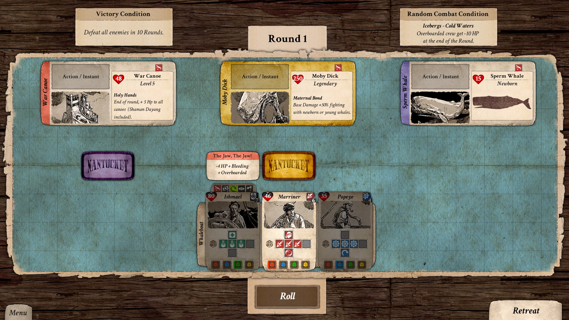
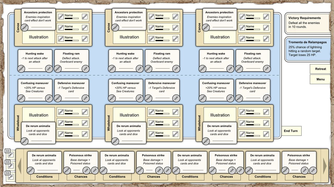
After the Christmas holidays we started fresh and re-worked (again) the combat concept. Version 3.0 is the one we introduced to you a couple of weeks ago. Here you have it in all its splendor:

CombatView_v3

Combat 3.0 – Final Mock-up

For today we stop here. We’ll talk about version 3.0 and all its UI more in depth in the next UI articles. I hope you enjoyed!

Keep tuned and don’t miss our Devs Play video series!

Capt_Eatbones

20
Feb
2016
DevBlog

UI Iteration #2: Shipwright

by Capt_Eatbones

Ahoy! Capt’s here!

Here I am again to continue our journey around the UI iterations we’ve been working on in the pasts months. If you haven’t read the previous articles, here you have the link:

Moreover, you surely have been following our video series “Devs play”, about us showing our game Nantucket development status. If you haven’t, well…just do it:

Now, back to where we were. Nantucket’s harbor has almost no more secrets for you…or so you believe >:] After the Tavern, we did iterate another crucial UI: the Shipwright’s. Here you have the old version, previous to the “steroids treatment”:

Shipwright_ShipsRequirements

Before the re-working, the Shipwright UI was split in two. Above you can see the main panel where the player would have repaired his/her ship or bought a new one. Again, the main idea was to represent this UI as an unfolded piece of paper where the shipwright owner would take note of all the ships available to be bought in the harbor. The little panel on the right was the player’s current ship panel.

Guess what? People trying the game was not able, most of the time, to understand which was your ship and which were the available to be bought. Too many elements were blending in confusing the player. Moreover, at the top left, the tab to switch between the Ships list and the Upgrades are almost invisible. It recalls you anything already happened with the old Tavern UI? Indeed it does!

What about the Upgrades panel then? Here it is the old version, before the “lifting”:

Shipwright_Upgrades3

In this section, more issues arose. The Ship technology upgrades are a very important aspect in Nantucket’s ship management. They let you, the captain, research and acquire technology to be able to “tune up” your current ship and the future ones. Also in this panel there are elements not clear: which are the Upgrades installed, which are to be installed, which can be upgraded and which not. I won’t dive into the functionality of this UI since it will be explained in the next video of our Devs play series.

Furthermore, being the two sections separated (Ships and Upgrades) and having the two tabs almost invisible made players almost unaware of the Upgrades view. This is a crucial UI so we couldn’t keep it as it was. A drastic change was needed. At that moment, I was sincerely a little scared of the complexity needed for this UI and of what should be necessary to change it for the better. I didn’t want to change everything, risking to cause more problems than solving them. But, you know what? There are moments where you feel it has to change, radically. So, I started working on it and came to this mock-up:

Shipwright_Proposal2

I wasn’t quite convinced about it. The basic idea of having the current ship and the selected one from the list one in front of the other was there. It just wasn’t proportioned enough: too much weight on your Ship – which is fine per Se – but if you have to choose a new ship, wouldn’t you like to have it shown full size for better comparison? Another important aspect is that the Ship technology upgrades panel is now in full sight: you don’t have to switch to another view. As I told, the main concepts were there…they simply weren’t fully developed.

So, I changed it again and come to a new proposal:

Shipwright_Panel

When I shown this two Mex and Bubb their reaction was: oh-my-god…you changed it completely! Now, that’s the kind of reaction I looked for! Simply, I wasn’t sure if it was a good one or not XD

This is the current Shipwright UI. As you can see, I switched the player’s current ship to the right placing the selected ship from the available ones on the left. Perhaps, knowing that a person usually reads from the left to the right it is not the best idea. What I tried to achieve with this decision is to maintain a certain amount of consistency throughout the game. In the Tavern UI, the Captain’s panel is placed where it would be in the navigation phase: on the left. Here the player’s ship panel is placed where it would be in the navigation phase: on the right. Visually, the ship view is the same as the one you have during navigation. We want the player to get used to these placements, so we don’t change them. Indeed, this is not always possible or is the best idea. In this case, we think it’s worth it.
Also, the available ship selected is presented and the same size as the one the player currently has. This places the other ship on the same level since it could be your next ship!
Right in the middle, between the two main panels, there are the details of both ships. I wanted here a direct comparison between information, so I decided to place them one in front of the other. The last thing I did was to re-work the Ship technology upgrades panel in order to have it visible at the same time.
Keep in mind that this structure is thought to be modular. The Shipwright, as all the Harbor buildings, can be of different levels. To each of these levels correspond a specific UI panel:

  • Level 1: only the “Your Ship” panel is visible.
  • Level 2: only the “Your Ship” and “Available Ships” panels are visible.
  • Level 3: all UI panels are visible.

As for other iterations, we asked for feedback. This new version has been generally welcome. We know there is a lot of information to process but we took the screen space needed to show them and we organized the elements in a more functional fashion. I adapted the new UI elements style to this layout so everything should be a lot clearer. Is it perfect? No. Is it a better solution? We believe so. It probably is a bigger step forward in comparison with what has been the last Tavern iteration.

If you feel that something is not right or that could be improved, please, let us know 😉 We’d really appreciate.
Well, I think I’ll leave you here for today. Remember, though: more articles are coming about our improvements in Nantucket!

Stay tuned!

5
Feb
2016
DevBlog

UI Iteration #1: Tavern

by Capt_Eatbones

Ahoy, fellow mates!

It’s been a while since our last meeting, the articles about the interface design process of our upcoming game Nantucket. If you missed them, here you have the links:

Well, I’m here again because of what I said in those articles: iterations. Oh yes. Right after the Milan Games Week 2015 (here’s the full coverage) we analyzed the received feedback and a relevant part was related to the UI not being clear enough.
We decided to rework the UI with the goal of make it more readable. The mistake I run into is trying to have an appealing UI, well integrated with the “Paper” theme. Too much integration leads to less readability of the UI elements, being too “camouflaged”.
An example of this are the generic buttons: too many different styles so the user cannot really say when an UI element is a button or not. Following this principle, I started re-designing basic elements such as button, check boxes, etc. up to whole UI panels.

Today’s article is about the first big change: the Tavern UI, used to hire/fire crew members. If you don’t know what’s this UI is about, please, read the previous article Looking for strong hands and a drink.
I’ll start by analyzing the UI that we had, highlighting those aspects responsible of the not-so-good User Experience.

HarborView_Tavern

I thought the Tavern panel as a page of a hired crew book, where the captain takes note of the details regarding his/her crew members. At the same time we needed a list of the available crew for hire in the Tavern. The old UI you see above, presents the list of members “For Hire” and “Hired” one on top of the other. The interior layout of each list is the same: on the left, the list of members and, on the right, the details of the current selected character. Being one on top of the other was thought to let the player compare visually the details. The main issues of this layout were the following:

  • Lot of information is displayed in little space.
  • Most of the information is in text form.
  • The right tabs filters are almost invisible to the user.
  • Drag&Drop assignment not clear.
  • Prestige points used too “camouflaged”.

As I stated in previous articles, design ideas don’t come from just one person. Actually, Daniele, our programmer, was who suggested a mock-up with a possible solution for the Tavern layout:

TavernConcept

As you can see, we started with a rough concept. Nonetheless it contains all the corrections, at least functionally, we needed:

  • Separated captain panel, on the left, as in the navigation phase. This way, the captain’s panel is always placed in the same screen area, no matter what phase you’re playing.
  • Split into two different panels the lists “For Hire” and “Hired”. The layout remains the same, more or less, but they are visually separated.
  • Added two buttons for Hire/Fire in the middle between the “For Hire” and “Hired” panels.
  • Bigger filters tabs.
  • A popup to be used as help tip for the player.

Even if the main changes are present in the above mock-up, there were still aspects not solved, as the Prestige point/cost. So, after this first suggestion, I worked on a bit more defined mock-up:

TavernNew

As you can see, a step forward has been taken in this second mock-up:

  • Added into the details area the illustration of the selected character. This is something that several people told us would have been better to have in order to visualize the person and not having just a name. It should add a bit of depth.
  • Each of the two panels “For Hire” and “Hired” has its own action button, “HIRE” and “FIRE”, point toward the direction of the change of places. This way we introduced an alternative to the drag&drop assignment/fire. Regarding the drag&drop, we also introduced a changing cursors while on a dragable element of the interface. This decision has been applied everywhere in the game, not just here.
  • Added a Prestige icon for each character label representing the Prestige cost of the person. At the same time, below the “Hired” panel, I added a Prestige Used progress bar, to better visualize the concept. Indeed, the Prestige Used icon and the Prestige Cost icon are quite similar.
  • Moved the Cancel and OK buttons to the bottom right. Most of the people who tried the game where always looking in that area the buttons to close/cancel the action.
  • The filter tabs are not bigger and colorful!

After this second step, I worked on the final version, the one that we now have implemented into the game currently. Here you have it:

TavernNew3

As you can see, some more changes occurred. I moved the tabs on top of the “For Hire” panel because placing them too far on the right made them still a bit “invisible”. Moreover, I placed a darker paper sheet on top of which the two “For Hire” and “Hire” panels are laid. This way I can keep the UI a whole panel. Also, you can see the new style for the buttons: since the paper usually has a lighter color, I decided to go for a darker one for the buttons, to make them stand out more.
The last change is about the captain’s panel: the health bar is now a more “common” red bar with the health value on top. I also added a XP bar, at the bottom of the captain’s picture, with the value showing the current amount against the one needed to level up.

We showed this new version to several people and everyone, even those who saw this UI for the first time, stated that it’s quite good. It’s not perfect but, surely, a big step forward.
We are up and running! We want the best experience for the players and for this reason we chose to keep tuning whenever and wherever possible.

Well, for today I’m done. Don’t worry, though: more UI iterations are coming! So, stay tuned and follow our Devs play video series!

31
Oct
2015
DevBlog

The way of the Paper (Part 2)

by Capt_Eatbones

Ahoy mates! It’s me, your loved Captain!

This week has been quite busy for us and, unfortunately, we haven’t been able to prepare in time the full coverage of our experience at the Milan Games Week 2015. It has been postponed to the next week.

Here I am with the 2nd article about “The Way of the Paper”. The past week we uncovered the very first steps we made during the User Interface design process for the game Nantucket. Let’s start from where we left:

NavigationMockup

As mentioned in the previous article, with this new interface layout we got a lot of information to be displayed on screen. We moved towards a more traditional strategy game. For me, this has been the start for working on the “final” interface artistic style while following the game design guidelines. Consider that I haven’t just copied what Mex had wrote down but tried to re-work his ideas and the interface on two aspects: usability and visual style. This meant several iterations and discussions about how to place the elements and how to make them the most user friendly. Here you have some of them:

At the time of these mock-ups, I wasn’t very satisfied. Each element was consistent with the interface style I had in mind but together they were not well integrated. The overall result was too chaotic. This is the reason why, eventually, I came to the first real version of the navigation UI we implemented later on. Consider that at the time the game development was at a very early stage and there was almost anything to see, not yet:

SecondIterationTop right: Ship Panel
Bottom left: Calendar Widget | Bottom right: Crew Panel

Here the Ship management has been simplified. If you followed this blog, you probably recognize most of the elements described in previous articles. If you haven’t, don’t be lazy: now it’s the right time to catch up!
The design process is really something that doesn’t stop. This way several iterations and elements are added/removed during the development. Here are a couple mock-ups that I blocked out for the new Inventory and Skill tree UI. The idea behind this was to change the least possible of the existing interface, so I thought of something that could be placed on top of it:

 SkillTreeInventoryMockupTop left: Skill’s Tree Panel | Top right: Inventory Panel

As you can see, this solution was not very elegant since it covered all the ship information. I decided then to make some more changes and I got this result:

NavigationTabsFinal

We had the overall left panel split into tabs. It was a little step towards a more tidy UI but it converted the left interface into a huge container where lot of information was not available when looking at other tabs.

This interface layout lasted until January 2015. We announced the game in December 2014 and started to have a playable version of the game, even if it was still missing most of the features and content. During Christmas holidays we had some time to spend playing the game. Consider that when you hit Play (the watch), on the Calendar, the game enters a real-time mode. We realized that the player had too much information on screen:

  • Follow what is happening on the map.
  • Keep an eye on your resources.
  • Managing the ship and your crew.
  • He/She cannot look at the crew and captain’s panels at the same time.

For those reasons, we decided to re-work the UI and we came back to the original Mex’s idea of floating panels. Even so, we choose to use collapsible versions of the floating panels,  introducing the widgets. Once again, I created a functional mock-up, to be able to make changes fast:

NavUI_Collapsed
NavUI_Opened

Above you can see the Navigation collapsed and opened interfaces. Now, the player has all the basic information needed during the real-time mode. This way, the player can open/close the panels he/she needs whenever he/she wants. Moreover, we decided to add to the Captain, Journal and Ship panels, at the top right, a button to let user decide whether that panel has to pause the game or not. We think that these changes let the player customize his/her experience according to his/her tastes. Here you have the final result:

FullyOpenedInterfaceCenter left:Captain Panel | Inventory Pop-up | Skills Tree Pop-up
Center right: Ship Panel / Crew Panel | Inventory Pop-up

This is the interface iteration we currently have and the one that we feel, at the moment, as quite good for the navigation phase. Actually this is a mock-up and not an in-game capture. We constantly refine everything we think can change for the better the user experience. Even now there are updates waiting for this UI, especially after a huge feedback received from the people who visited us at our boot at the Milan Games Week.

Well, it’s been a long article but I wanted to show the process that we followed and still follow to approach the UI design and many others aspects. As you can see the differences between the first concepts and the final result are many: both in terms of usability and style. We think that the last iteration is a lot better than the first ideas. Even so, we’d like to know what do you think about. Please, feel free to comment.
I leave you now, but keep tuned. Next week we will publish, for sure, the coverage of the Nantucket’s showcase at the Milan Games Week 2015.

Godspeed and Happy Halloween to everyone!

24
Oct
2015
DevBlog

The way of the paper (Part 1)

by Capt_Eatbones

Fill your paper with the breathings of your heart.

William Wordsworth

Arrrr! Long time has passed since my last journal log: I’m sorry but handling a crew takes quite a lot of your time.

My mates are attending the Milan Games Week, showcasing Nantucket to the Italian public. So, today, it’s my turn to give you some more information about the project development.
This article is about the user interface of Nantucket. In particular I will focus on the process we followed to get to the final result.

Interface design is something crucial for the User Experience or UX. As a relevant part of the design process, we started quite soon to work on the interface concept. Now, for the game we wanted to create, the visual style had to be very specific to the time context: 19th century sea life, ships, a captain…basically, for us, it meant Paper. When you start analyzing ideas, usually, you take a pencil and start sketching down something. That’s where we started, even if we did it on digital paper. This is the very first mock-up of the screen space layout (author: Mex):

VeryFirstMockupTop left: Combat View | Top right: Crew Panel
Bottom left: Ship Panel | Bottom right: Navigation Map

As you can see, there’s no reference to the art style. At this stage it’s still too easy to influence interface design choices with artistic flavors. Once the main idea is blocked out, it’s time to go a step further refining it and, maybe, imagining it:

FirstCombatViewTop left: Ship Panel | Top right: Crew Panel
Bottom: Combat View

The image above was a first mock-up of the combat phase – the Map view is completely missing here. As you probably can see, the Ship view is quite different from the one we have now. This is the result of several iterations we made. At the very beginning, one of our main references was FTL. We thought to structure the Ship interior in a similar way, assigning task to the crew in a more visual level. This example is also a first trial to imagine the UI style: look at the Crew panel. That’s a classical UI art style copied and pasted from a sea game screen capture, just to test it.

However, I wanted to push further. Since I’m an artist, I usually suffer if I don’t start sketching/art-making. That’s exactly what I suggest you to resist to, at least until the first design ideas are not defined. This doesn’t mean you cannot sketch down ideas but don’t get too attached to them and be prepared to abandon them if not suitable to the project needs.

When we were looking for visual references, we came across these sweet paper cut-out scenes:

We thought: why don’t we represent the whole game as a paper cut-out scenery? That has been the spark to get to the actual art style. Here you have the very first trial where the “paper” style came out:

Cut-OutStyleTop: Combat View
Bottom left: Ship Panel | Bottom right: Captain/Crew Panel

 Here, the Combat view would have been the typical paper cut-out scenery. Imagine the sea creatures coming out, all nicely animated: a sweet picture, indeed. Now, do you remember when I told you “don’t get too attached to your early mockups”? I leave the rest to your imagination…

At this stage, it’s quite usual that the game design changes frequently and, perhaps, drastically. The combat would have needed more space, flexibility and depth. We discussed about ideas about how to solve the “depth” issue. I noticed that we were trying to make choices trying not to change the cut-out idea. That’s the main reason why the concept art is sensible subject at this point. You don’t want to leave what you like and you try anything to justify it. It’s not going to work this way. The main goal is to think about the best solutions for the user. It doesn’t matter if your game looks amazing if playing it is a pain in your “sacred” ass.

For that reason, we started working on new solutions and Mex came with these new mock-ups:

Again, the image elements are very rough and simple. The main concept is quite different: the World Map is the background while the Navigation arrangement and Ship data (Ship panel), the Crew data (Crew panel) and the Place/Date (Calendar) are overlaid.
During the development of this idea, I was working on the World Map artistic style. Here was born the idea to play on top of the Captain’s cabin table, where the map is placed. Even the game mechanics changed and set sail towards a more traditional strategy game. This meant a lot more information to display on screen. As you can see changes are the rule during development. Of course, your goal is to limit them to those really needed.

Well, here ends the first part about Nantucket’s interface design. Next time we will take from here and you will see how and why we ended with the current interface. I leave you now, but keep tuned. Don’t miss, next week, the coverage of the Nantucket’s showcase at the Milan Games Week.

Godspeed!