Ahoy! Capt’s here!
Here I am again to continue our journey around the UI iterations we’ve been working on in the pasts months. If you haven’t read the previous articles, here you have the link:
Moreover, you surely have been following our video series “Devs play”, about us showing our game Nantucket development status. If you haven’t, well…just do it:
Now, back to where we were. Nantucket’s harbor has almost no more secrets for you…or so you believe >:] After the Tavern, we did iterate another crucial UI: the Shipwright’s. Here you have the old version, previous to the “steroids treatment”:

Before the re-working, the Shipwright UI was split in two. Above you can see the main panel where the player would have repaired his/her ship or bought a new one. Again, the main idea was to represent this UI as an unfolded piece of paper where the shipwright owner would take note of all the ships available to be bought in the harbor. The little panel on the right was the player’s current ship panel.
Guess what? People trying the game was not able, most of the time, to understand which was your ship and which were the available to be bought. Too many elements were blending in confusing the player. Moreover, at the top left, the tab to switch between the Ships list and the Upgrades are almost invisible. It recalls you anything already happened with the old Tavern UI? Indeed it does!
What about the Upgrades panel then? Here it is the old version, before the “lifting”:
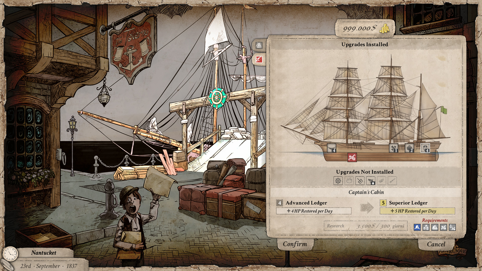
In this section, more issues arose. The Ship technology upgrades are a very important aspect in Nantucket’s ship management. They let you, the captain, research and acquire technology to be able to “tune up” your current ship and the future ones. Also in this panel there are elements not clear: which are the Upgrades installed, which are to be installed, which can be upgraded and which not. I won’t dive into the functionality of this UI since it will be explained in the next video of our Devs play series.
Furthermore, being the two sections separated (Ships and Upgrades) and having the two tabs almost invisible made players almost unaware of the Upgrades view. This is a crucial UI so we couldn’t keep it as it was. A drastic change was needed. At that moment, I was sincerely a little scared of the complexity needed for this UI and of what should be necessary to change it for the better. I didn’t want to change everything, risking to cause more problems than solving them. But, you know what? There are moments where you feel it has to change, radically. So, I started working on it and came to this mock-up:

I wasn’t quite convinced about it. The basic idea of having the current ship and the selected one from the list one in front of the other was there. It just wasn’t proportioned enough: too much weight on your Ship – which is fine per Se – but if you have to choose a new ship, wouldn’t you like to have it shown full size for better comparison? Another important aspect is that the Ship technology upgrades panel is now in full sight: you don’t have to switch to another view. As I told, the main concepts were there…they simply weren’t fully developed.
So, I changed it again and come to a new proposal:

When I shown this two Mex and Bubb their reaction was: oh-my-god…you changed it completely! Now, that’s the kind of reaction I looked for! Simply, I wasn’t sure if it was a good one or not XD
This is the current Shipwright UI. As you can see, I switched the player’s current ship to the right placing the selected ship from the available ones on the left. Perhaps, knowing that a person usually reads from the left to the right it is not the best idea. What I tried to achieve with this decision is to maintain a certain amount of consistency throughout the game. In the Tavern UI, the Captain’s panel is placed where it would be in the navigation phase: on the left. Here the player’s ship panel is placed where it would be in the navigation phase: on the right. Visually, the ship view is the same as the one you have during navigation. We want the player to get used to these placements, so we don’t change them. Indeed, this is not always possible or is the best idea. In this case, we think it’s worth it.
Also, the available ship selected is presented and the same size as the one the player currently has. This places the other ship on the same level since it could be your next ship!
Right in the middle, between the two main panels, there are the details of both ships. I wanted here a direct comparison between information, so I decided to place them one in front of the other. The last thing I did was to re-work the Ship technology upgrades panel in order to have it visible at the same time.
Keep in mind that this structure is thought to be modular. The Shipwright, as all the Harbor buildings, can be of different levels. To each of these levels correspond a specific UI panel:
- Level 1: only the “Your Ship” panel is visible.
- Level 2: only the “Your Ship” and “Available Ships” panels are visible.
- Level 3: all UI panels are visible.
As for other iterations, we asked for feedback. This new version has been generally welcome. We know there is a lot of information to process but we took the screen space needed to show them and we organized the elements in a more functional fashion. I adapted the new UI elements style to this layout so everything should be a lot clearer. Is it perfect? No. Is it a better solution? We believe so. It probably is a bigger step forward in comparison with what has been the last Tavern iteration.
If you feel that something is not right or that could be improved, please, let us know 😉 We’d really appreciate.
Well, I think I’ll leave you here for today. Remember, though: more articles are coming about our improvements in Nantucket!
Stay tuned!
