16
Apr
2016
DevBlog

UI Combat: Let’s fight!

by Capt_Eatbones

Drink, ye harpooneers! drink and swear, ye men that man the deathful whaleboat’s bow…

This will be the last article about the combat and before we start, I’d like to point out a couple of aspects of Nantucket. As you probably know, one main aspect of the game style is that is made of paper. It’s an experience played onto the Captain’s table, in his cabin and sometime is played in a harbor. Even so, the harbor is an illustration drawn on paper too.
When we thought of a combat style for this game, it came natural to us moving towards something mostly related with a table and a bunch of pieces of paper: a card game.
This combat is not a Trading Card Game. We’ve chosen a card style due to the context of this game: ship, crew, sailing. And, of course, we like playing card games too. Nantucket, per se, is not a card game, but includes a little card game played during the combat. Now, let’s move on with the article main subject.

Today, we are going to have a look at the actual combat phase UI. I want to share with you a first mock-up (this is a frame of an animated one):

CombatAnimMockupCombat 3.0 – Animated Mock-up (Still)

In the picture above you can see a still of the animated mock-up we prepared before starting the implementation. We needed this to define the timings of the overall combat experience. If you have red the previous articles (if you don’t, you can catch up here and here) you already know how the combat has evolved and how the previous Deployment phase works. Once you start the real fight, you have to roll the combat dices of the crew members you have in your whaleboats and decide which command is the best to win against your opponent.

CommandChoiceCombat 3.0 – Dice roll and Command choice

 As you can see, these images are from an early mock-up and the dices faces are not final. The main concept, though, is there: according to the crew members you’ve placed onto the whaleboats you’ll have several dices combinations. Each dice face, when rolled, will unveil a specific command. Once the the dices have been rolled the player can chose which command he/she prefers. When the command needs a target, ad arrow will appear to point the target the player wants.

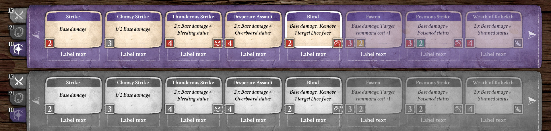
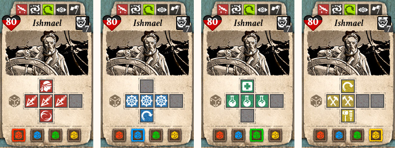
Let’s have a look at the design of the crew card:

CARDSCombat 3.0 – Crew cards

Above you can have a look at the final version of the cards. I’ll show you each element from the top to the bottom:

  1. Combat states icons: Bleeding, Stunned, Poisoned, Blind and Surrender. These icons will appear according to the combat development. Except for the Surrender state, all the others are inflicted be the opponent. This label will appear and disappear according to the presence of states.
  2. Crew member information: Health, Name, Class and Level. In this case, I chose to use the heart icon to be sure everyone understands the meaning of it. Previously, we used a red/rope health bar but still it was not clear enough.
  3. Crew member picture: this is the same used in the whole game, whenever we access to the information of this man.
  4. Combat dice.
  5. Combat dice switcher.

The hearth of this card is the combat dice. In the above image, you’re looking at the Captain’s card which is special. Since the Captain has all 4 working skills (Hunting, Sailing, Science and Crafting) he will have 4 different combat dices: one per working skill. According to the evolution of the working skill the related combat dice will evolve too. The working skill faces are 3, no more. The remaining 3 faces are used in this way: 2 for specific skills in use and 1 for specific objects in use. This special dice faces will enable special combat commands.

During combat you can use the Dice Switcher to decide which working skill of your avatar you prefer to use. Simple crew members will only have 2 Dice Switchers: the one related to the working skill they are specialized on and a generic one (related to the Cabin Boy half-class).
Before the roll of the dices the player can chose which combat dice to use for the roll. This way, you can chose the best strategy combination to use each turn. Of course, its crucial that you placed the right men during the Deployment phase.

creatureCards
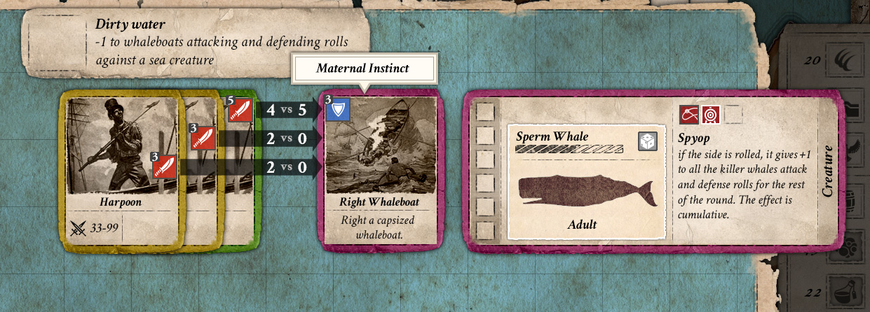
Combat 3.0 – Creature Cards

The Creatures card is a little simpler than the Crew one. First of all, there are 2 different cards: Standard and Special. Above, on the left, you can see the Standard card style while, on the right, you have the Special card style. As you can see, Moby Dick will be a Special card because its class is Legendary (and because it’s Moby Dick, I’d say!). From the left to the right, these are the elements of the Creature card:

  1. Creature type label: here you have the name of the species and the color of the card. The color is important because it lets you know which color will be its attack cards.
  2. Action/Instant card slot: here the creature can play two different type of cards. The effect of these cards is used for the creature itself.
  3. Creature picture: below the Action/Instant slot.
  4. Creature information: Health, special creature’s Name (or the species name instead), Category, Special ability (or the species shape instead) .
  5. Combat states icons: here will appear the same icons used for the Crew card, except for the Surrender.

CombatView_v3Mockup
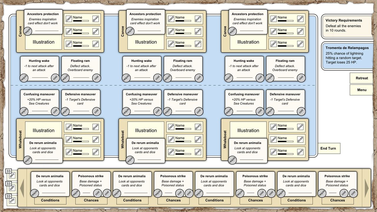
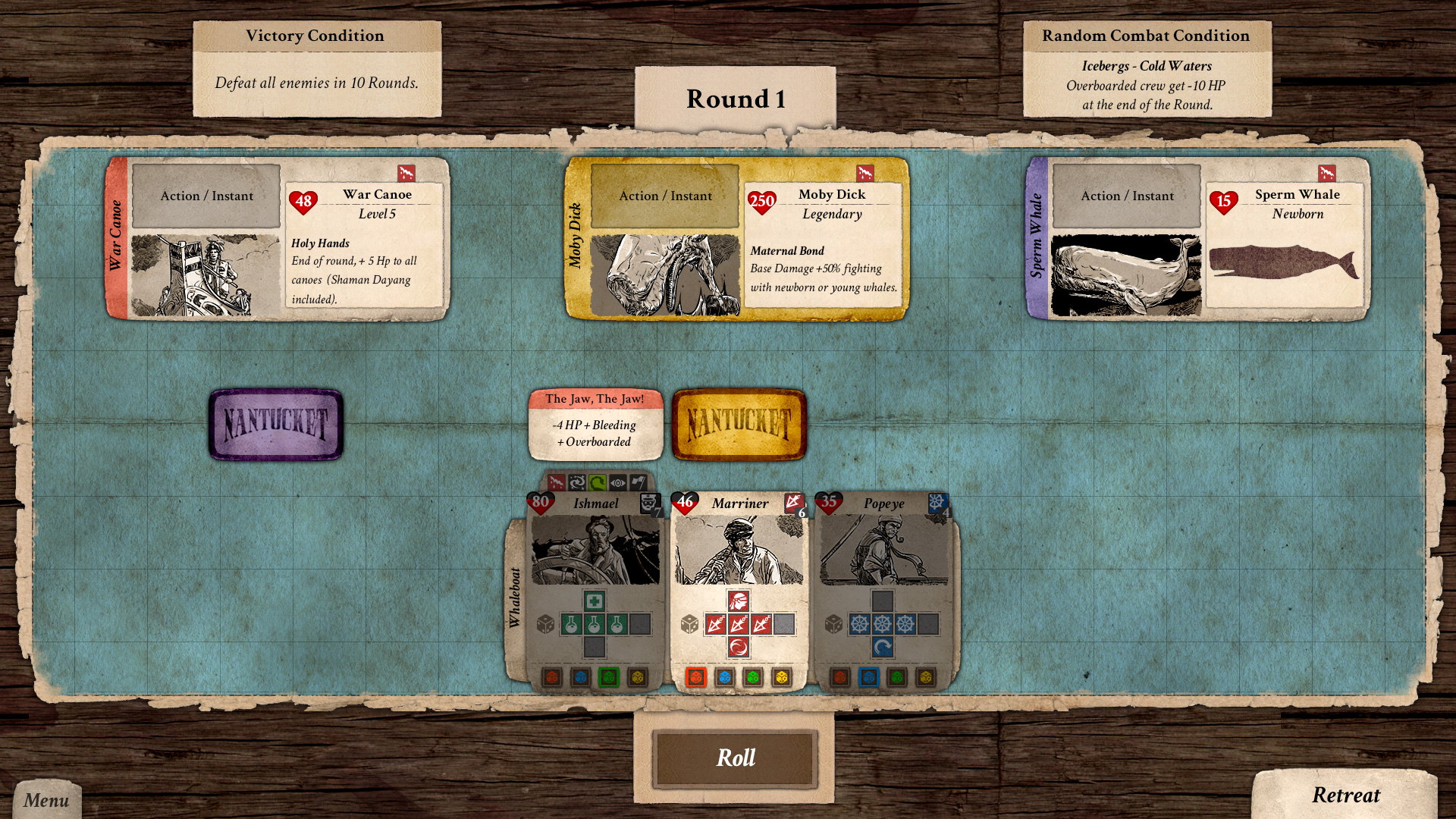
Combat 3.0 – Mock-up

Remember that not always defeat the enemy all the enemies will be asked. The Victory conditions card, in the top left, tells the player the requirements to the success. Moreover, in the top right, there is the Random Combat Condition card that will be drawn each turn and will define the combat conditions each time (bonus, malus, etc.).

And what about the Crew VS Crew combat? Here you have it!

CombatCrewView_v3Combat 3.0 – Crew VS Crew mock-up

Here the combat will work the same, the only difference is the there will be less crew member on your side. Moreover, you will be able to see the combat dices of your opponents. The only real difference is in the opponent card: the colored label is placed at the bottom of the card. This way you have a reference to who is attacking who.

Well, I don’t want to spoil too much of this since we will have specific videos about the combat in our “Devs Play” series (watch it here).

Hope you’ve enjoyed like I did in sharing this with you.

Keep tuned and Godspeed, as always, from your Capt_Eatbones!

9
Apr
2016
DevBlog

UI Combat: Deployment

by Capt_Eatbones

Arrr! Your Captain summons you!

Today I want to talk a little more about the combat’s UI: the Deployment. During this phase, the player is asked to spend a little time, before the actual combat, to decide who will participate in the fight. This is a crucial moment since part of the strategy and the outcome will depend on the choices made here.

This part of the combat has always been in the design so it’s something that’s always been there, even in previous combat iterations:

CombatDeploymentCombat 1.0 – Deployment

The main idea is let the player choose from the list of all the crew members on your ship. Every crew member has his own skills, traits and states. Several skills are related to the combat so, for example, according to whom will be assigned to the fight the player will have different options during the next phase: the actual combat.
This list has the goal to show all the crew member information related to his possible use in battle. As you can see, in the picture above, a description of the skills useful in combat is show on the right of the crew label in the list. This layout has not changed too much during the next iterations. Actually, let’s move on the next iteration and see what changes have been made (if you haven’t red the previous article about, you can do it here):

CombatViewDeployment_v2Combat 2.0 – Deployment

Now, as you can see we have a card deck. More specifically, the Attack cards deck. In the previous iteration we placed the crew list in the middle of the combat board. This time we thought to place it right on top of the selected whaleboat to make crystal clear to which boat the crew member would be assigned. The layout is not that different, except the crew member details on the left of the list. This time the player is able to have a better look to the selected crew information: Traits, Skills, Objects and, of course, the combat dice. The interesting thing of this solution is that while you’re assigning crew members to the whaleboat, you see changing the available cards on the deck. This underlines even more the importance of this moment of decision making.
We are ready to move to the last iteration to see where our final stop will be (sure it will be the last? :D)

CombatViewDeployment_v3Combat 3.0 – Deployment

 While in the previous iterations the crew assignment was handled only through drag&drop, this time we introduced buttons. In our opinion not everyone finds the drag&drop the easiest solution nor the most precise one. Moreover it’s not always clear where to drag.
Here the crew list has been flipped horizontally. On the left is the list while on the right there is the preview of the crew card. This card contains several elements:

  • Name of the Crew member
  • Health points
  • Class and Level
  • Current Combat dice
  • Combat dices switcher

I won’t explain all the functionalities of the combat since there will be specific videos about this in our Devs Play series (watch the episodes here). However, I want to point out that in this version the combat dice is in full sight. Previously there was a dice icon that would open a tool-tip with the dice faces information. Now the player can review the combat dice at any moment.
Well, it’s all good but, are we going to fight only at sea? Of course not! As we told you in other occasions, there is also the combat between crews, on the ship deck. Here is a glimpse of what the deployment in Crew vs Crew would look like:

CombatCrewDeployment_v3Combat 3.0 – Deployment: Crew VS Crew

The crew list stays the same. It will just take less time to deploy our men since there will be less of them.

That’s it for today, we’ll be back with the last article about the UI of the actual combat phase.

I hope that you’ve enjoyed and godspeed!

2
Apr
2016
News

Devs Play Ep. 5: “Setting Sail”

by picaresque

Arr!

A new episode of the series “Devs play” is out! In this episode we will set sail from Nantucket’s harbor to explore the seven seas.

Watch the Episode 5:

In today’s video Mex, our game designer, will leave the Nantucket’s harbor and he will set sail looking for new adventures.

Enjoy the video and hold fast!

The Picaresque Team

26
Mar
2016
DevBlog

UI Iteration #X: Combat

by Capt_Eatbones

Ahoy! Capt_Eatbones is here!

Today I’m going to tell you the story about the combat UI design for our upcoming title Nantucket.

Why a story? Well, it deserves this introduction because it’s one of the core mechanics we’ve been struggling more on, iterating a lot… Of course, we knew since the beginning of the production that we wanted a well-thought combat. For this reason we kept pushing on it. In this article, I’ll guide you through the iterations we went through for the combat UI.

MOCK-UPS…MOCK-UPS EVERYWHERE!

NewCombat_v2Combat 1.0 – Vector Mock-up

We started again with a functional model and then worked on it. The above picture shows the starting mock-up for version 1.0. As you probably guessed, we love strategy games and we are big fans of tabletop and card games too. The main idea for the combat scenario was to represent it as a more detailed map on top of the navigation map. We imagined the combat as a card game and this idea is still our goal.
On top of the sea combat area, are placed the two sets of cards: Whaleboats (left) and Creatures/Canoes (right). This layout applies also to Crew VS Crew, when the combat takes place on the ship’s deck. In the middle area, you find the Attacking and Defending slots where the action cards are played. As you can see, there is a big arrow path in the middle area: it’s meant to declare who is attacking who. In this combat version, all cards are placed and then played all together in sequence. This meant that there could be 3 overlapping big arrow paths, generating confusion. To avoid this, we decided to use a color code to identify who was doing what. Here you have the final result for the main cards (Whaleboat and Creature):

CombatCardsIllustrations

Follows the final mock-up:

CombatCardViewCombat 1.0 – Final Mock-up

Here you can have a look at the final composition and layout. The action cards are placed in the middle area and the colored border tells you to whom they belong. After this step, we implemented this version in the game. We asked for feedback, as usual, and we were told that too much information was unclear during the clash of the action cards:

  • What really means the dice value?
  • How is calculated the damage value?
  • Who won?

To answer these questions, we re-worked a little the moment of the execution of the action cards placement and we got to this solution:

CombatDiceResultsStudy

Multiple action cards could be used to attack a single Whaleboat/Creature card. In this combat version, there are attack and defense dice faces. One defense face can only contrast one attack face, so in case of a multiple attacks the other attacks pass right through the defense. By using these dark arrow we hoped to better clarify these relations. Moreover, the middle numbers are thought to tell the final result of each card confrontation.
Well, after Greenlight and, especially, after the feedback received during the Gamelab 2015 (read about it HERE), we decided to re-think the whole design, both the mechanics and the UI. One thing was clear: too much information in too little space. We had to learn from other games and (re)start simple.
The first step towards version 2.0 was a simple test. We tried to expand the action cards of each main card at the bottom, a sort of action deck:

NewCombat_v5Combat 1.1 – Vector Mock-up (Action deck)

This solution is something that several people asked because all the info related to the possible actions where visible only through the use of tool-tips. If you don’t know that a tool-tip exists then you’re missing valuable information. Nonetheless, we didn’t like the result: the action deck is hiding part of the combat area. The answer to this was “let’s re-think it all” (more or less).

NewCombatSVG2Combat 2.0 – Vector Mock-up

Version 2.0 introduces a new action card concept: Attack, Support and Inspiration cards. This time each card has a single clear effect but it’s applied only if the dice rolls meet the card requirements. Looking at the above picture, you see that the main cards layout is similar to the version 1.0. Even so, now there is a dedicated space, below the combat map, where the action cards deck is shown.
The main concept is quite interesting since it’s based on a bet on what the dice roll result will be. First you choose the action cards you want to use and then you roll the dices and hope for the desired result to come.

NewCombatSVG3Combat 2.1 – Vector Mock-up

 We tried also a horizontal layout, a little asymmetrical. We liked it more due to the better space reserved to Victory and Sea conditions. Moreover, it reduces the space used by the action cards decks. So, thumbs up!

CombatCardsStates

CombatViewDeployment_States
Combat 2.1 – Action cards and Deck Mock-ups

In the picture above you can see the style of the action cards, according to the different states, and the new deck. Then we put together the final mock-up for this second version of the combat:

CombatView_v2Combat 2.1 – Final Mock-up

Now, we loved the idea of betting on the dice rolls (surely from a drunken sailor point of view!). However, playing it revealed several drawbacks of this concept. Two of them are the most annoying:

  • Too many missed turns.
  • The more advanced the action cards you can use are, the less chance of success you have using them.

You know, even if you have experience as a player or even as a developer, you always make mistakes. The “secret” is to find a solution to those mistakes. That’s really it…but it really isn’t that simple ^^ Nevertheless, we were in a better position than before. This version was a better one compared with the other but still we had a way to go.

After the Christmas holidays we started fresh and re-worked (again) the combat concept. Version 3.0 is the one we introduced to you a couple of weeks ago. Here you have it in all its splendor:

CombatView_v3

Combat 3.0 – Final Mock-up

For today we stop here. We’ll talk about version 3.0 and all its UI more in depth in the next UI articles. I hope you enjoyed!

Keep tuned and don’t miss our Devs Play video series!

Capt_Eatbones

19
Mar
2016
DevBlog

Follow your winds

by Mex

Voiceless it cries,
Wingless flutters,
Toothless bites,
Mouthless mutters.

J.R.R. Tolkien

Ahoy there!

I hope to find you all well. Here I am with a new feature presentation for our upcoming title Nantucket. Today I’m going to write about something we are currently working: winds.

Nantucket is set in the XIX century, so during the Golden Age of the Age of Sail, where the efficiency of sailing vessels was at its peak and immediately before steamboats started to take their place at sea, forever changing the way of sailing. In fact, steam powered ships were the first ones to make the obvious possible: if I have to go from point A to B, I just have to take a straight course to my destination. This was not the case during the Age of Sail, where you had to take into account winds and their patterns, since most of them blow predominantly from a single general direction.

So, the first things we did was to implement a map of the global winds that you can access by using the winds filter of the Captain’s log. By taking a look at it, you will be able to notice 3 types of areas:

  • Areas with wind patterns: in which you will find some wind for sure, probably blowing in the direction shown or really close to it.
  • Areas with strong wind patterns: similar to the area above, but with strong winds. It’s characteristics of the oceans area under a latitudes of 40 degree.
  • Areas with no patterns: areas of sea in which the wind could blow in any direction and strength.

Winds on Map

How can you understand what’s the wind situation in your current position? Just take a look at your compass rose, it will tell you three things:

  • Wind direction: the direction in which the wind is currently blowing
  • Wind strength: we are currently using 3 different strengths (none, normal, strong).
  • Your sailing direction: so, if you are sailing windward or leeward (against the wind).

The most important element is for sure the wind direction in comparison with the one of your ship. Sailing leeward it’s a really difficult and inefficient way of sailing since it requires a lot of maneuvers to keep moving. It translates in the game in going slower (according to wind strength also really REALLY slow). Going slow means burning resources and money and, if that it’s not enough, I’m sure you will reconsider it the first time a pirate ship will be biting your ship’s stern.

If inside the areas with wind patterns is pretty easy to schedule your course, outside of them you have to keep an eye to your compass rose to avoid unpleasant surprises. The wind there is much more unstable and you could end up struggling for days.

In the next episode of our DevsPlay series coming next week (if you have missed the first four episodes, you can watch them here), we are going to show some gameplay related to the navigation so, if you want to take a look to everything we discussed here on “paper”, keep an eye to our Youtube channel.

That’s it for today. See you soon guys!

Mex

12
Mar
2016
News

Devs Play Ep. 4: “Newspaper & Merchant”

by picaresque

Ahoy!

A new video of the series “Devs play” is out! Today you’ll be introduced to the mechanics of the Newspaper and Merchant UI in the harbor.

Watch the Episode 4:

In today’s Episode 4 Mex, our game designer, will talk about the harbor’s Newspaper guy and Merchant building UI. Read and learn how to get information about new whales sightings, historical events and how to deliver goods around the world! Moreover, if you’re in need of supplies, go to the Merchant!

Enjoy the video and Godspeed!

The Picaresque Team

5
Mar
2016
DevBlog

A new way to handle your harpoons

by Mex

Is Ahab, Ahab? Is it I, God, or who, that lifts this arm?

Herman Melville

Ahoy there!

It’s been awhile since I wrote my last post, but there have been a few posts from Captain Eatbones about interfaces and we have inaugurated our new video series “Devs Play“, in which we started showing some gameplay from our upcoming title Nantucket. If you have missed our first three episodes, you can watch them on our Youtube channel.

In today’s post, I’m going to write about the changes we made to the combat system in the past months to improve the overall gameplay experience. During our tests and by showing the game around to people, we realized the combat system needed some rework. The main issue was related to its length, since every combat had too many empty rounds.

So, the biggest change has been completely changing the way commands were triggered. In the previous iteration, commands had to be chosen before knowing the dices rolls and, since their costs were subject to a lot of variables, really often selecting the cheapest command was the safest solution, granting an higher chance to do something during a round. Yes, it’s bad, especially considering the fact you level up your characters to get cool commands, and you want to play them.

CombatView_v3Combat Mock-up

In this new version the commands are “engraved” in the dices, so you actually roll the dices before selecting a command among the ones available in each whaleboat. Every class has a base command occupying 2 sides of their combat dice and then special sides (and commands) that are unlocked by leveling up your crew or assigning an object to a specific character. In details:

  • Hunters are good in dealing damage. According to their skills branch, the can be specialized in hunting whales or fighting men (such as pirates).
  • Sailors are specialized in evasive maneuvers, so in removing enemies action cards.
  • Craftsmen are a support class and they allow you to re-roll some dices.
  • Scientist can heal you characters and save them from death.

So, every round, the enemies play their commands (cards) face down. Then you roll your dices and pick a command per whaleboat. Pretty easy, also if the strategies involved are quite a lot.

First of all, whales have different behavior according to their type and age, so you want to “tune” your strategy according to the enemy you are facing. Then there are random condition cards appearing each round, related to the surroundings of the sea area in which the combat is taking place (icebergs, rough waters etc.). These condition cards are pretty strong and they will affect a lot your choices in each round.

Finally, with this new  system, you will be able to set your strategy well before the beginning of a combat. You can shape your dice and the ones of your crew during your travels, leveling up, or simply selecting crew members fitting your style of play. For example, you can choose to have a lot of hunters, maximizing your chance to hit every turn or decide to have a more versatile approach, picking more classes.

Remember that hunting is just a part of the dangers you can face at sea, and probably not even the deadliest.

That’s it for today. The new combat will be covered by a “Devs play” episode, so you will be able to have a more detailed grasp about it pretty soon. Keep following us for updates and see you next time!

Mex

27
Feb
2016
News

Devs Play Ep. 3: “The Shipwright”

by picaresque

Ahoy there!

The new “Devs play” video series Episode 3 is out! You’ll be introduced to the mechanics of the Shipwright UI in the harbor.

Watch the Episode 3:

In today’s Episode 3 Mex, our game designer, will guide you to the harbor’s Shipwright building UI. Learn how to buy a new ship or what upgrades are available for yours.

Enjoy the video and wait for new episodes to come!

The Picaresque Team

20
Feb
2016
DevBlog

UI Iteration #2: Shipwright

by Capt_Eatbones

Ahoy! Capt’s here!

Here I am again to continue our journey around the UI iterations we’ve been working on in the pasts months. If you haven’t read the previous articles, here you have the link:

Moreover, you surely have been following our video series “Devs play”, about us showing our game Nantucket development status. If you haven’t, well…just do it:

Now, back to where we were. Nantucket’s harbor has almost no more secrets for you…or so you believe >:] After the Tavern, we did iterate another crucial UI: the Shipwright’s. Here you have the old version, previous to the “steroids treatment”:

Shipwright_ShipsRequirements

Before the re-working, the Shipwright UI was split in two. Above you can see the main panel where the player would have repaired his/her ship or bought a new one. Again, the main idea was to represent this UI as an unfolded piece of paper where the shipwright owner would take note of all the ships available to be bought in the harbor. The little panel on the right was the player’s current ship panel.

Guess what? People trying the game was not able, most of the time, to understand which was your ship and which were the available to be bought. Too many elements were blending in confusing the player. Moreover, at the top left, the tab to switch between the Ships list and the Upgrades are almost invisible. It recalls you anything already happened with the old Tavern UI? Indeed it does!

What about the Upgrades panel then? Here it is the old version, before the “lifting”:

Shipwright_Upgrades3

In this section, more issues arose. The Ship technology upgrades are a very important aspect in Nantucket’s ship management. They let you, the captain, research and acquire technology to be able to “tune up” your current ship and the future ones. Also in this panel there are elements not clear: which are the Upgrades installed, which are to be installed, which can be upgraded and which not. I won’t dive into the functionality of this UI since it will be explained in the next video of our Devs play series.

Furthermore, being the two sections separated (Ships and Upgrades) and having the two tabs almost invisible made players almost unaware of the Upgrades view. This is a crucial UI so we couldn’t keep it as it was. A drastic change was needed. At that moment, I was sincerely a little scared of the complexity needed for this UI and of what should be necessary to change it for the better. I didn’t want to change everything, risking to cause more problems than solving them. But, you know what? There are moments where you feel it has to change, radically. So, I started working on it and came to this mock-up:

Shipwright_Proposal2

I wasn’t quite convinced about it. The basic idea of having the current ship and the selected one from the list one in front of the other was there. It just wasn’t proportioned enough: too much weight on your Ship – which is fine per Se – but if you have to choose a new ship, wouldn’t you like to have it shown full size for better comparison? Another important aspect is that the Ship technology upgrades panel is now in full sight: you don’t have to switch to another view. As I told, the main concepts were there…they simply weren’t fully developed.

So, I changed it again and come to a new proposal:

Shipwright_Panel

When I shown this two Mex and Bubb their reaction was: oh-my-god…you changed it completely! Now, that’s the kind of reaction I looked for! Simply, I wasn’t sure if it was a good one or not XD

This is the current Shipwright UI. As you can see, I switched the player’s current ship to the right placing the selected ship from the available ones on the left. Perhaps, knowing that a person usually reads from the left to the right it is not the best idea. What I tried to achieve with this decision is to maintain a certain amount of consistency throughout the game. In the Tavern UI, the Captain’s panel is placed where it would be in the navigation phase: on the left. Here the player’s ship panel is placed where it would be in the navigation phase: on the right. Visually, the ship view is the same as the one you have during navigation. We want the player to get used to these placements, so we don’t change them. Indeed, this is not always possible or is the best idea. In this case, we think it’s worth it.
Also, the available ship selected is presented and the same size as the one the player currently has. This places the other ship on the same level since it could be your next ship!
Right in the middle, between the two main panels, there are the details of both ships. I wanted here a direct comparison between information, so I decided to place them one in front of the other. The last thing I did was to re-work the Ship technology upgrades panel in order to have it visible at the same time.
Keep in mind that this structure is thought to be modular. The Shipwright, as all the Harbor buildings, can be of different levels. To each of these levels correspond a specific UI panel:

  • Level 1: only the “Your Ship” panel is visible.
  • Level 2: only the “Your Ship” and “Available Ships” panels are visible.
  • Level 3: all UI panels are visible.

As for other iterations, we asked for feedback. This new version has been generally welcome. We know there is a lot of information to process but we took the screen space needed to show them and we organized the elements in a more functional fashion. I adapted the new UI elements style to this layout so everything should be a lot clearer. Is it perfect? No. Is it a better solution? We believe so. It probably is a bigger step forward in comparison with what has been the last Tavern iteration.

If you feel that something is not right or that could be improved, please, let us know 😉 We’d really appreciate.
Well, I think I’ll leave you here for today. Remember, though: more articles are coming about our improvements in Nantucket!

Stay tuned!

12
Feb
2016
News

Devs Play: Ep. 2 “The Tavern”

by picaresque

Ay, ay Sir!

Episode 2 of the video series “Devs play” is out! Our brave ship mates will unveil the secrets of our game Nantucket.

Watch the Episode 2:

In today’s Episode 2, our lead artist, Capt_Eatbones, will introduce us to the harbor’s Tavern building interface. Have a look at how to hire, fire and manage the crew on your ship. Beware, though, of drunken sailors and troublesome people!

Enjoy the video and stay tuned for the next episodes!

The Picaresque Team